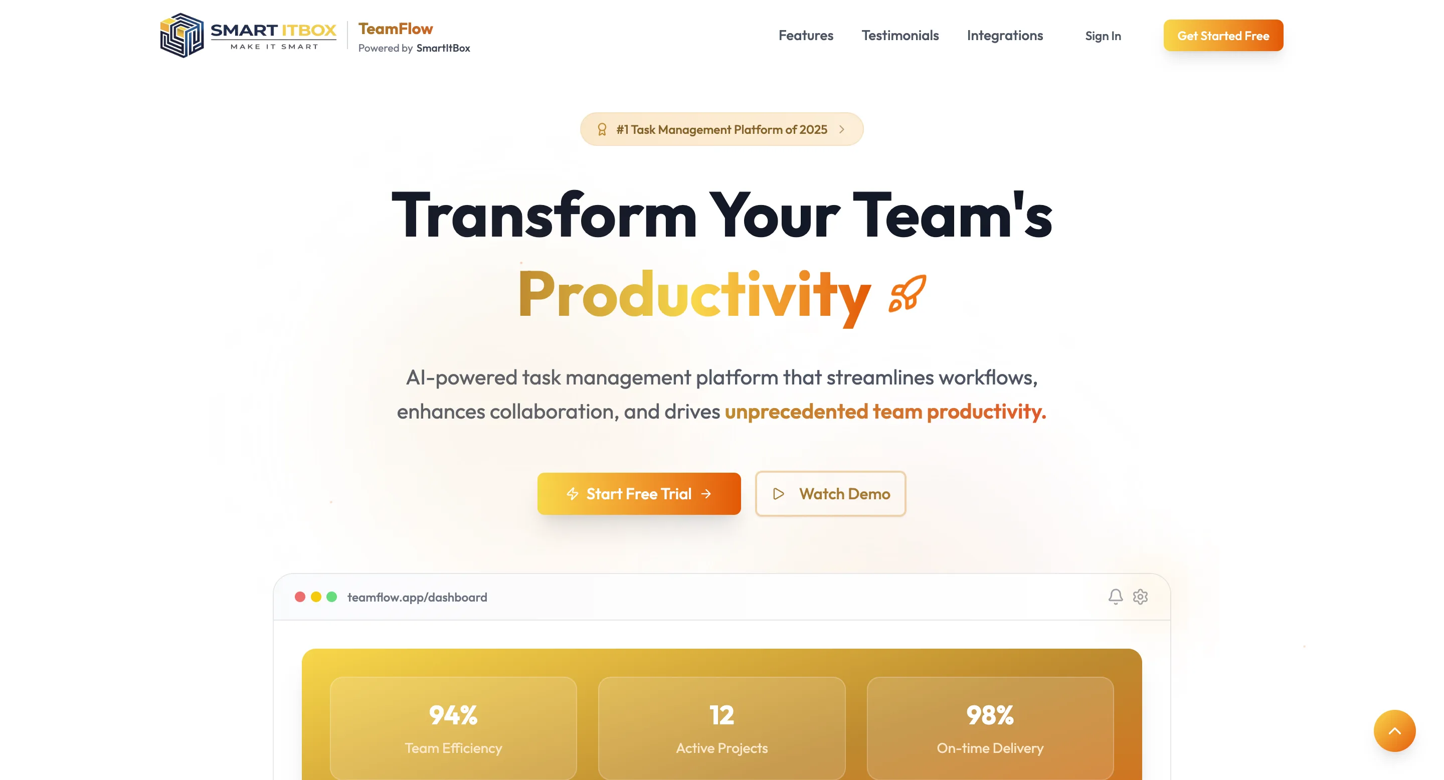
The task management space is crowded. Notion, Asana, Monday, ClickUp — users have seen it all. When TeamFlow, powered by Smart ITBox, needed a frontend that could stand alongside those names, the design and execution had to be sharp from the first scroll.
I built the entire React frontend solo in under two months.
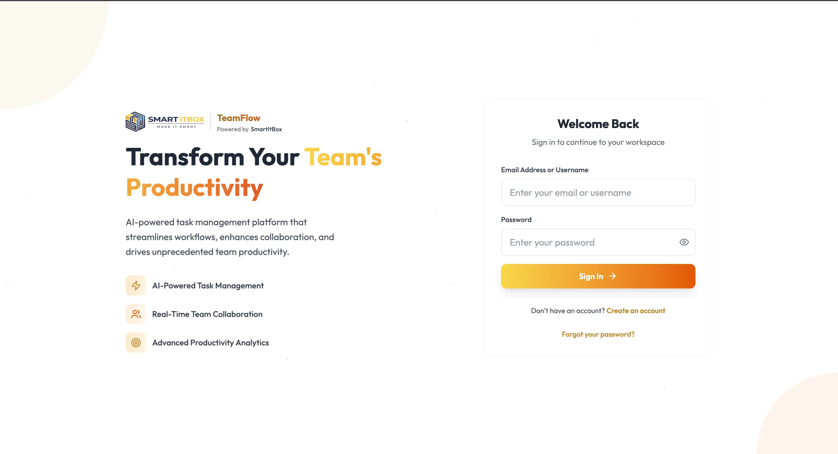
What the Platform Is
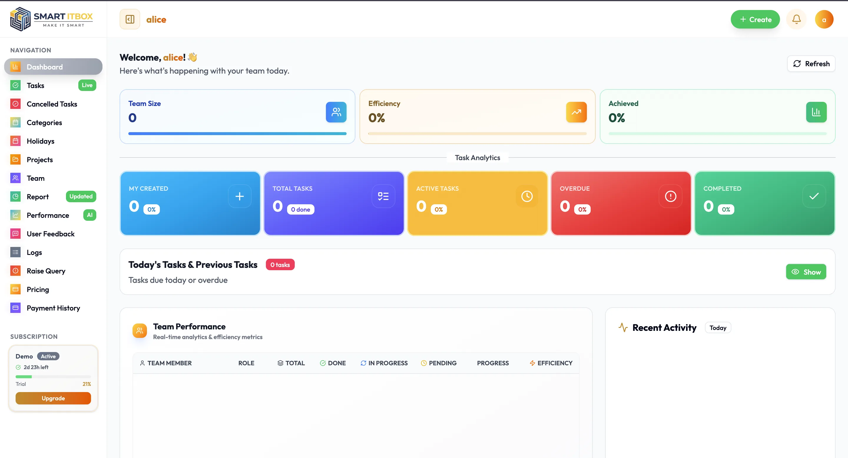
TeamFlow is an AI-powered task management platform focused on team productivity — real-time collaboration, AI-assisted task handling, and advanced productivity analytics. The landing page makes bold claims: 94% team efficiency, 98% on-time delivery, 12 active projects tracked simultaneously. The frontend had to make those numbers feel credible, not like marketing fluff.
The Landing Page
The hero section sets the tone immediately — clean typography, a product dashboard preview embedded below the fold, two clear calls to action. Features, testimonials, and integrations are surfaced in dedicated sections, each designed to answer a specific objection a potential user might have before signing up.
Getting a SaaS landing page to feel premium without feeling overdesigned is its own discipline. Every spacing decision, every font weight, every colour choice either builds or erodes trust. Working within the Smart ITBox brand — the yellow-orange palette, the bold typography — while making TeamFlow feel like its own product required careful visual judgment.
The Onboarding Flow
The registration experience was one of the more technically interesting parts of the project. Rather than a single sign-up form, TeamFlow uses a three-step onboarding flow: mobile number entry, OTP verification, then account details. Each step is clearly indicated with a progress marker — Step 1 of 3, with Mobile, OTP, and Details shown as stages.
This kind of multi-step flow requires careful state management in React. The UI needed to feel continuous across steps, with the progress indicator updating smoothly and form state persisting correctly between stages. OTP flows also have their own UX considerations — timer displays, resend logic, error handling — all of which had to feel polished rather than functional-but-rough.
Third Project for Smart ITBox
TeamFlow was my third frontend delivery for Smart ITBox, following their marketing website and the SmartCA financial platform. By this point I understood their design language well — the orange-yellow brand system, the preference for clean white backgrounds, the bold headline style. That continuity made the work faster without making it repetitive, because each product served a completely different user and purpose.
Built with: React.js, Multi-step form flows, OTP authentication UI, SaaS landing page design